Wednesday, 30 March 2011
final type
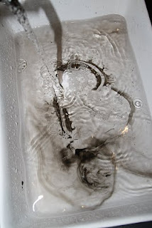
heres my final type dispersal. I'm really happy with this one actually, i think it looks really finished and exactly how i wanted it to be. I would use it and other people said they would too so thats definitely a good thing. This type idea comes from the idea of chinese whispers, the message gets diluted and decayed the more its passed over. I think you could also look at it in terms of nature (water) eroding man's creations. Ink is drawn on a wet ceramic plate which initially disperses, then when part dry, I have poured water over the ink which washes some of the ink away. Looks cool i think, I'm happy.
Monday, 28 March 2011
type research
The research i did at the start of the brief but didn't scan in properly. I really loved the sketchy one from the initial stages of planning a typeface and the expressive nature of chinese character. The symbols i found interesting because of the way its presented and the solid black on thin looking graph paper. However when first thinking of type i mainly liked the solid simple stuff, cos you cant go far wrong with helvetica can you? also found pick me up's font hehe... geeky.
Sunday, 27 March 2011
lights, camera ...action?
a few more ideas for using different techniques like Ruscha's paintings. Playing with shadows in light and making it look diffused through paper. i like the effects these can create but not sure i have time to play around with this enough to make it good.
distorting type
Heres my first attempts at making type with ink in water but becoming very hard to control and too hard to see the letters although it looks cool and textured.
Tuesday, 22 March 2011
shadowcatcher
When i went to the Shadowcatchers exhibition toward the end of feb I saw some amazing stuff, thought the things by Susan Derges was particularly amazing. all about water and natural forms set in this magical twilight shadow with deep blues and white making the pieces really just gorgeous. The compositions were inspired, the way they were made into these huge wide arches just made the level of detail and intricacies beautifully tangible and exciting. like your eyes are caught up in the movement of the water and it could be in progress right at that moment. I would love to do something with water for the types and try to make some natural patterns of my own. lets see how it turns out.
Monday, 21 March 2011
Cuts exhibition
Come check out our exhibition on the budget cuts on at
Studio 54 Architecture
54 Rivington Street
London
EC2A 3QN
020 7729 7818
info@studio54architecture.co.uk
Our private view is on this thursday 6-9pm with free drinks for anyone who wants some.
all details on our blog here.
Ed Ruscha that absolute babe
Once again all over Ruscha's paintings in acrylic. No idea how he gets that misty effect but love the way it looks like a faded old film. Very dramatic. Since looking at a new typography brief i really wanna play around with that shadowy effect of the text. Its interesting how it makes the viewer think while looking at an essentially empty painting. His use of language- random words, spacing and colour all blend seamlessly to make this very striking impact on the viewer.
Sunday, 20 March 2011
website design
Here are my final website designs based on my recent installation. I think this best reflects my work. I would want it to work in a way similar to the apple exposé, with the starting page with small thumbnails of my work which opens out when portfolio is selected. Would have to add my print work and some of my other work, might look a bit over crowded if i did though.
Saturday, 19 March 2011
catching up in my blogging
Heres the Zine i made. I tried to get some photography from The Decemberists gig i went too the night before the deadline, in hindsight, mistake. I wanted to make a classic zine like some of the ones shown in our lecture, sold at gigs about music but obviously I didnt have enough time. So Im re making it as an illustrated lyric book for the band and hopefully will look better than these murky un personal cut outs. I dont think Ive made anything worse! sigh.
Friday, 18 March 2011
zines
here are some 80's zines i found on essential ephemera that are quite interesting band zines. i like the really raw black and white photocopied/printed feel to them. their so stark and some really nice compositions on the page. i like some of the type as well.
Wednesday, 9 March 2011
Final Yuko Installation
Here are the photos from the installation i made for that live brief. My aim was to make a 3d environment with visual and physical and auditory stimulus to immerse you in the songs. The drawing are of a personal response to the music and a interpretation of the lyrics. Such a pain in the ass to put up but it looked cool for the all of 4 hours it stayed up :) who knew making installations was so much effort!
Subscribe to:
Posts (Atom)