Sunday, 31 October 2010

E.E.Cummings


I love E.E.Cummings' poetry, have done for a long time. Nothing makes me feel the way his words do. I did some illustrations about him in the first year in the greetings card project. Im not sure I did the best I could, but hey I might do more later on.

some of his poems I particularly like recently though:


since feeling is first
who pays any attention
to the syntax of things
will never wholly kiss you;

wholly to be a fool
while Spring is in the world

my blood approves,
and kisses are a better fate
than wisdom
lady i swear by all flowers. Don't cry
- the best gesture of my brain is less than
your eyelids' flutter which says

we are for each other; then
laugh, leaning back in my arms
for life's not a paragraph

And death i think is no parenthesis


in spite of everything
which breathes and moves, since Doom
(with white longest hands
neatening each crease)
will smooth entirely our minds

- before leaving my room
i turn, and (stooping through the morning)kiss
this pillow, dear
where our heads lived and were.


here's a little mouse)and
what does he think about, i
wonder as over this
floor(quietly with

bright eyes)drifts(nobody
can tell because
Nobody knows, or why
jerks Here &, here,
gr(oo)ving the room's Silence)this like
a littlest
peom a
(with wee ears and see?

tail frisks)
(gonE)
"mouse",
We are not the same you and

i, since here's a little he
or is
it It
? (or was something we saw in the mirror)?

therefore we'll kiss; for maybe
what was Disappeared
into ourselves
who (look). , startled

Monday, 25 October 2010

Print asses

Assess yourself using these bandings.
0-29 no show - did not try

30-39 failed to understand

40-49 minimal application, 40 is a pass

50-59 satisfactory

60-69 really good

70-79 great

80-100 Excellent - perfect


starting 12/10/10 and 19th
How many Prints did you make this weeks? 8

How many of these taught you something new? the linocut taught me you cant really make linocuts retrospectively as you need to register and cut layers one at a time. dont start with the ending black line it will only end in disaster!

How many hours did you spend in the Printmaking Workshop? 10?

Competence in practical printmaking techniques:
59-60 I have the look I want to use and an image I can use for one of my pages I just need to practice making interesting layerings and markmaking.

Thoughtful and imaginative use of printmaking:
59 -65 not sure how thoughtful I was in making my prints but I am happy with my linocut and my monoprints have been useful in testing ideas in composition
Visual Sensibility; understanding and expressing ideas in images:56 needed a bit more help in this area as I had a hard time starting off laying out the narrative

Using research to expand knowledge, enrich thinking and affect your work: 65 have been looking though a lot of work made by artists to influence my work and have made a few pages of drawing looking at wild life programs to try to get more realistic forms in my work.

Saturday, 23 October 2010

printing


starting print I really wanted to experiment with linocut and that really visceral expression of marks and textures. I'm really happy with the composition of the white paper print, considering it was a quick experimental print to start myself off.
The grey drawing is going to be my next linocut. Hoping to play with the light using different inks and layerings; although i'm not sure how still....

Friday, 22 October 2010

Museum of everything


Went to the Sir Peter Blake's Museum of Everything yesterday, It was very eclectic as you may expect. All the memorabilia was centered on circus shows and freak shows, which was rather strange to say the least in some cases. I liked the room where all the toy came to life, it sort of reminded me of horror films like 'Dead Silence' but in a good way.
The taxidermy reminded me of Hitchcock's 'Psycho' in a bad way though. Having a load of dead animals arranged in amusing situations just creeped me out loads; as well as seeing where some of the fur had rubbed away to see the leathery skin. Just generally rather weird.

I did like the random David Hockney painting/photograph in the room with all the freak show posters. also the chinese tapestries were interesting. Over all pretty cool day out I recommend.

David Borrington


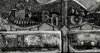
recently been referred to david borrington by my tutor. He creates a range of prints dealing mainly with the way he interacts with the world through his dsylexia and dyspraxia. "My work shows the historic grandeur of an unfamiliar civilisation – the location, language and temporal context of which is unclear.

I aim to confuse the viewer in a manner similar to how I feel and cope in everyday situations. To me, objects have a tactility and are aesthetically interesting but difficult to comprehend. My work operates in a similar way; it is highly detailed and familiar in its symbolism and yet it is also obscure."

If I ever do acid this is what I want it to be like

Animal Collective - "Lion in a Coma" from ori toor on Vimeo.


Frame-by-frame flash animation for the song “Lion in a Coma” by Animal collective. Created by Ori Toor for his final project at the Shenkar School of Engineering and Design in Israel. I love animal collective.

Thursday, 14 October 2010

More silliness


More from the studio project with Dsypraxia cos Im special

Tuesday, 12 October 2010

more print research


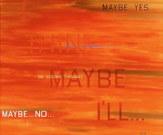
while looking at pettibon stumbled on this cool book by Ed Ruscha

"OH / NO is a fore-edge book, with printing that appears when the gilt edge is fanned one way or another. Fore-edge painting was popular in the 18th century but rarely used today. Graphicstudio research encompasses the recapture and revitalization of such technology, enabling the development of fore-edge printing. The pages of the book are blank, perhaps a commentary on the meanings we would ascribe, or fail to ascribe, to such seemingly simple words.

When the book pages are fanned in one direction the text OH appears. When the book pages are fanned in the opposite direction the text NO appears.

OH / NO
2008
Cloth-covered hardbound book with two color fore-edge printing and silver leaf edges.
Text by the artist
Closed book: 5 1/4"H x 7 1/2"W x 2 1/16"D "


also his stuff is amazing

Always room for a little Raymond Pattibon


Love his style and use of inky black and white as I enjoy doing a lot of the same also could be handy for reference with linocut.

also If anyone knows who the Twilight Sad are, they have brought out this album cover for their album " Killed my parents and hit the Road" which is a pretty cool rip off of the Goo album I think. Love it! (last image)

Being a retard


I (...or more accurately David Foldvari) has decided that I'm going to do my new project on Dyspraxia and what kind of things I deal with/have to compensate for. For example; being scared of falling down the tube escalators, walking into chairs, spilling ink all over the floor or falling up the stairs to the studios and being able to save my cup of coffee on the way down. :D So here are some pages from my sketchbook/final piece which will hopefully be part of an installation yay!

CD project


Here is one of my final drawings for the cd project which i then printed a layer of acrylic green with a hand impression taken away,
from over the mouth. unfortunately I didn't get time to scan in the final thing.

corinna sargood


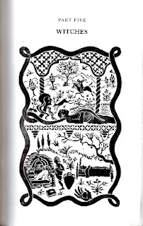
While looking at the Aesop's Fables for print, I also was re-reading my book of Angela Carter's book of fairy tales; which are collected stories from around the world and kind of similar I think. It's illustrated by Corinna Sargood who has such a definitive style in her linocuts that I cant help but look to her for inspiration.

Saturday, 9 October 2010

Jane Dwight


Saw these while looking for references for my next tattoo and loved the colours
and everything about these really. Very chinese but still rather contemporary.
'like'

Fever Ray


Since I haven't updated my blog in a while I think I'll do it all in one go.
I recently saw Fever Ray at Bestival and absolutely loved the atmosphere and
imagery they created for their set.
Karin Dreijer Andersson is such an enigmatic artist,
it was cool to see she still kept up that persona
in such a interesting way through her performance. And obviously her music is so moving and weird I love it.
It was like having a religious experience, only it was real... as some might say.

Altho I have heard she has now quit Fever Ray after one album
because "she's finished what she wanted to achieve with it", which on the one hand I can well believe
but on the other, I would be sad if she did quit so I take the opinion its not true.

Sam Weber and Shaun Tan


Loving Sam Weber and Shaun Tan still, pretty much my favorite artists ever.
the colours and way they use paint/ink is so amazing and something quite unique.
The texture and the surreal nature of their subjects are just so interesting.
here are their sites, take a look:
http://sampaints.com/
http://www.shauntan.net/